Tuesday, 28 October 2014

The Real Apple Store


When people think of an apple store most people immediately think of the brand Apple. However, Borough Market in London recently opened an actual apple store presenting over 1000 different apples to mark the areas 1000th birthday. I think its really clever how they are mocking one of the most known brands in the world, and they put this across in a really effective way because they also presented and displayed all the apples on little white plinths just like the actual Apple stores. 
This attracted over a thousand people in one weekend because most people can relate to the humour they are putting across, and for people that live in that area its really good publicity for the market and what they produce. 

Sunday, 26 October 2014

Who Runs The World..


I found this magazine on a Virgin train, and the sophisticated style of it attracted me to looking at it. I really liked the monochrome background and type, against the gold 'Canary Wharf', I would expect something like this from Canary Wharf as its a very high end business and social place in London. I love how the main text is 'Who Runs The World?' which is a line in Beyonces song about women running the world and how things have changed throughout the years from women being looked down on, to modern day where they are mostly treated the same as men. This links in perfectly with the background picture which has been art directed perfectly to suit what message they are trying to get across. The way she is posing in a dominating stance and the shadows and lighting that has been used puts across that women are becoming as powerful, or even more powerful than men. The magazine being very good quality paper also showed me that the magazine is aimed at high end business/fasion people. 

Tuesday, 21 October 2014

Packaging Design


I found this picture on Pinterest that instantly caught my eye. I searched for 'design' and a wide range of different designs came up but this design for a water bottle was by far my favourite, this is because its so modern due to the geometric shape and the colours of black, white and silver. This also keeps with the trends that are around at the moment due to the shape of it, as slick shapes and unique designs are very popular in architecture, advertisements and many other design disciplines right now. I also love the way they have art directed it having the different angles of the bottle and the lighting that creates all the shadows and colours around it, which makes the photo so much more exciting. It is important that brands make their products stand out from the rest, and one of the ways of doing this is through the design of their product, this is because people will remember it and even buy it because they want to experience this new exciting product, this results in higher sales. 


Sunday, 19 October 2014

Jelly Beans

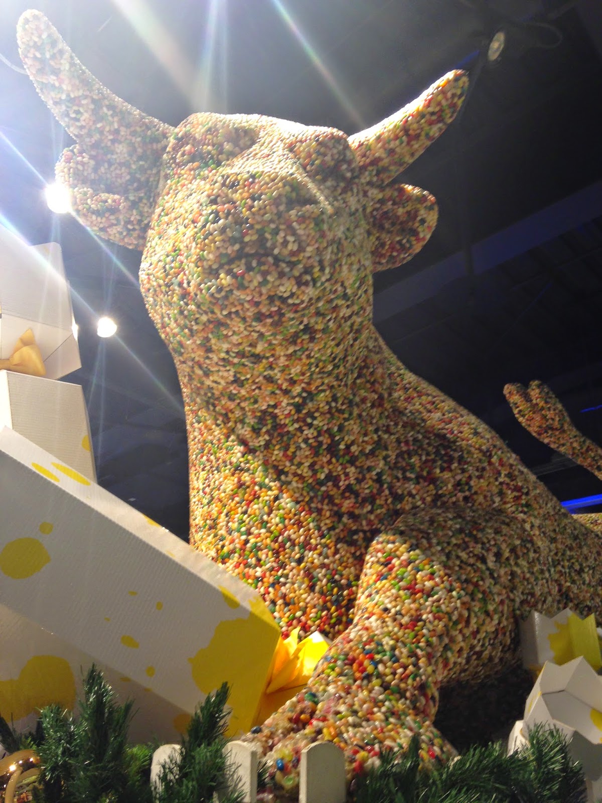
I was at Birmingham yesterday in the Bullring, and we decided to go into Selfridges because they have recently put out all their christmas items and displays. As we was walking around the sweets and chocolate displays this is the display that really amazed me. It was the bull from the Bullring covered in all the different flavoured jelly beans that you can get, I couldn't stop looking at it because I couldn't believe that it was actually all jelly beans. This display appeals to people of all ages because most people loves sweets, and it would especially appeal to children because as soon as they see that display I guarantee that their faces would light up and they wouldn't want to leave. This display and many other displays creates an experience for every person who walks in the shop, and this persuades people to come back because they have a unique experience shopping. 

Mid Season Sales


I was looking at retailers online websites and saw a running theme of mid season sales that are on at the moment. The one that stood out most for me was River Islands website, this is because there website and stores are always very sophisticateed and stylish,  and their way of showing that they have a sale on is far from their normal style. Yes, it stands out compared to the rest of their website because it's so tacky, but this is what they want. I feel it's a good way of catching peoples eyes when they first go on their website, but I still feel they could have kept with their style of presenting things. Compared to Topshops website, Topshop has shown that they have a sale on in a lot more trendy way because they have used their simple type on a tye dye style of  background. This still caught my eye as much because it's the first thing you see on the page, but it's just a lot more visually appealing than River Islands website because of the use of colour and type. The thing I like about Topshops, is that if you saw it without knowing it was from Topshop you would have a slight feeling that it's Topshops kind of style, whereas when I look at River Islands, I would have no idea, and would probably guess at a sofa or carpet store, not a successful, fashionable clothes shop. 


Tuesday, 14 October 2014

Chip & Dip


I was looking at a range of product designs on Pinterest and saw this design that can solve a problem that most people in their life has come across at least once. Not being able to walk, eat your chips, and use a dip at the same time. I always have this problem and I can't stand a dry chip, so I thought this design was perfect. The fact that someone has took a everyday problem and has given such a simple solution and design to it amazes me, and I really wonder why this design hasn't been recognised by big brands such as McDonalds, KFC and Burger King. 


Monday, 13 October 2014

Online Retail

I was recently reading articles on Design Week and other online design magazines, and I came across a running theme of unlikely retail shops taking over the high street. I then found an article about Amazon opening their first physical store which really caught my eye. However, as I read further into the article I realised that it is not what it seemed and Amazon was just opening a mini warehouse where people can pick up orders and return/exchange them, so in my opinion not really a shop at all. I was really disappointed in this as the headline made me really excited because everyone loves Amazon, but to me its not really a store, its just a warehouse like amazon already is. So could Amazon really work expanding as a store? Or should it really stick to being online? 

Sunday, 12 October 2014

A Different Angle


Architect Moatti-Rivieres, has recently unveiled the new glass floor within the Eiffel Tower, 57 metres above from the ground. Viewers can look down and see the world going by beneath them which I personally would hate myself, but for most people it would be an amazing experience. I found this on the Design Week website (http://www.designweek.co.uk/news/the-eiffel-tower-has-a-new-glass-floor/3039191.article) and this was one of the pictures that was on there and it really caught my eye because of all the geometric shapes and patterns. It does not look like the Eiffel Tower at first glance, it looks like a weird pattern that someone has created, but as you focus on it more, you can see the shape of it as the photo was taken from an unusual angle looking up from the bottom. This is what is amazing about the Eiffel Tower, its just not a landmark or building, its a piece of art work. 

Saturday, 11 October 2014

Trying Something Different

https://www.youtube.com/watch?v=lp-EO5I60KA

Ed Sheeran has very recently released his newest video for his song Thinking Out Loud. This is one of my favourite videos of his because he normally comes across as a stand alone busker, who wears t-shirts and jumpers, and has a unique way of performing. However, in this video he is trying something totally different than what he is used to, which I find really exciting because I never thought that I would see him in a suit and waistcoat doing a technical slow dance. This has really inspired me because if Ed can go out of his comfort zone and try something different, I would love to try and do this within my work and course because trying something different might lead to more exciting and stronger ideas. 

Thursday, 9 October 2014

Rebuilding Memories


This is the new set of videos that Starbucks have recently released promoting the different ways that people use Starbucks and why you should go there. The Rebuilding Memories video is my favourite video because of the emotion of the story and how they have turned a  really sad and negative part of life, into a positive and creative way to overcome things. 
I also love how it tells a story throughout the video so its not just advertising that Starbucks is an amazing place to go, but you can really connect to the advert because of the emotion of the story and that people can relate to what she is going through, which results in the audience being encouraged to not just ignore the advert, but remember it too. 
Starbucks are trying to get across that there are many ways that people use their shops and that its not always just for drinking coffee. I think it is really interesting that they have got videos from all over the world and combined them to make a montage of videos that create an interesting and exciting way to promote Starbucks.

Monday, 6 October 2014

The Ted Baker Experience


Visiting Manchester today was a unique experience because of all the different styles and trends I saw in the space of a few miles. I saw some weird and wonderful street styles, to sophisticated and stylish designs and shops. My favourite shop we went to was Selfridges as I am always amazed by the visual merchandising and window displays. However, compared to the London Selfridges I was also very disappointed with the one we visited today, because it had no window displays and very little striking aspects about the designers displays. 
Not all was negative because on the very top floor I saw Ted Bakers accessories display and it was just stunning. All the florals, pinks and blacks just stood out as they really complimented each other and the theme they wanted to get across. It felt like I was at a tea party with all the flowers, the stools, the candy stands, and the overall presentation of it. Even though Ted Baker is already a beautiful brand, displays like this just make the shopping experience for everyone so much more exciting. 


Sunday, 5 October 2014

Nautical Trend


One of my favourite designers is Michael Kors, and I was looking down his Instagram as he advertises a lot of his products through social networking. As I was analysing his page, I found that every section of photos had a theme of what was on trend at that time. One of my favourite trends was the nautical trend as you can see from the screenshot I took above, this was because I love how he photographs his products in exotic and exciting places that all link in with one another which produces a really nice set of photographs. He uses social networking a lot, especially Instagram for advertising his products, not in a poster type way, but he makes it so much more aesthetically pleasing by placing his products in unique destinations, and also uses hashtags underneath the photos to get his audience involved. 


Saturday, 4 October 2014

Jean Paul Gaultier Inspiration


One of my biggest inspirations within my work this year was Jean Paul Gaultier's 'On The Docks' advertising campaign. I find this poster really interesting because of the juxtaposition in the two people and what they are putting across in the advert. I love how he has advertised the two different perfumes into one advert which really worked well together because of the intensity of each photo. This was my starting point for my project, and I visited Jean Paul Gaultier's exhibition which was the best exhibition I have been to because it gave me so much inspiration and a wider insight into what his work was about. I took all this inspiration and created my own perfume bottle, advertisement and display for a new perfume for him using his style of design. 

Thursday, 2 October 2014

'Mr Grey Will See You Now'


I went to the cinema today, and this film advertisement for 50 Shades Of Grey really caught my eye mainly because of the contrast in colours. The pure white background with Mr Grey in the black suit standing dead in the middle, draws your eye immediately to him and the dominating stance he is standing in. How he is higher than everyone else in the building looking down on the world, show's his power he has over people as this is what the story is about. The sentence 'Mr Grey Will See You Now' also stands out quite a lot, as this shows the nature of the film and the mystery that surrounds him and what he is going to do with his next client. This could draw you in to seeing the film because its kind of an open invitation into Mr Grey's office which could entice people to go and watch it. 


Wednesday, 1 October 2014

Taken 3


This is the link to the trailer for Taken 3 that was released last night. I have always been a big fan of the Taken films, so when I saw this it made me really excited for it to be released in January. I feel the trailer is really effective because like all the other movie trailers in the sequence of films, it shows so much action and tension, that you just want to know what is going to happen next.
Also, I loved how the last line in the trailer was 'good luck'; which was exactly like the trailer for the first movie. This shows the beginning of the series and the possibly the ending of the series.
Another aspect that really stood out for me was how the 'Taken' logo at the end of the trailer had been manipulated to change the 'e' to a '3' which was simple, but combined to two parts of the title together which looked really good.